Open
Close
Play
Close
Last updated on 26 Feb 2021 - 3 min read
Web design trends advance and develop every passing year further enhancing the current trends. With web designers focusing more and more on good user experience (the key to successful web design), designers need to be able to create the most usable and attractive brands and websites. With minimal design, it allows designers to create effective results with fewer elements, simplifying the users’ journey and interactions without compromising on style. Does having fewer elements make the design simple? Not worth the money? Not at all, even with fewer elements, each element has been carefully placed to catch the users eye and attract their attention to the points of interest; it can even be viewed as more complex.
The phrase “less is more” is used a lot more often now with designers choosing minimal design as their go-to choice, but what does it actually mean? I can get into the intricacies of large explanations but no one wants that, instead, I’m going to show you an example of two websites that have both been awarded sites of the day. Thus meaning a collective group of judges have judged the websites and decided that they are award-winning designs. One of them is considered to look busy and one is considered minimal. So, which one is right?

This website was submitted by Goliath Entertainment; an event management company. This is a perfect example of more doesn’t necessarily mean better. Even though a lot of thought has been put into the site and it is very well designed, however, it’s so busy at first glance it is can be very confusing to look at. The image above is the landing page of the website where there are 6 call to actions on this landing alone. The only one that stands out to me is the burger menu in the left corner but the phone, mail, statue, lamp, ballon and poster are all buttons that only move once the mouse is hovering over them. It is complex and requires you to interact with the elements to know something is going on there. The site is only one page so the rest of the site is below the landing and the animations, colour palette, art style are all beautifully designed, it’s no wonder they won an award for the site however as beautiful as the web design is, it is far from minimal.
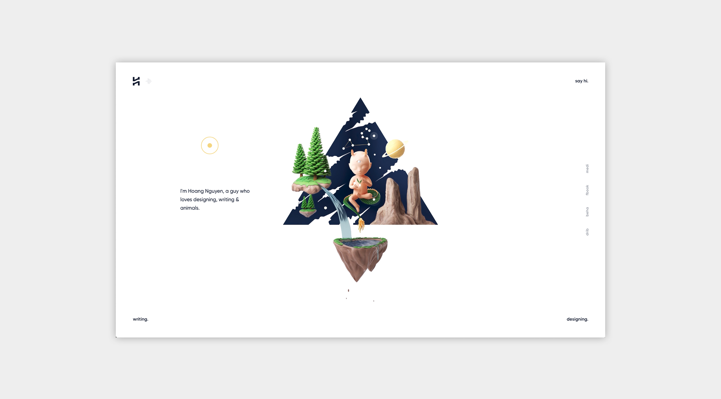
This site is by Hoang Nguyen, a designer that took a different route to his website design. This site is beautifully simple and minimal, the complete opposite of the previous example. This example shows the beauty in simplicity and why minimal design looks simple but is still complex all the same. Having a minimal design allows the designer to control how the user views the website – the previous example presented so much information all at once it was difficult to know what to focus on. This design allows you to breathe and actually take in each element for what it is. Instantly, the first thing you see is the floating baby in the sky with a third eye and tail, which is also next to the text, drawing your eyes to the pulsating circles which when the mouse hovers over, changes the text to a different bit of information. Another thing to point out is that there is no scrolling, every bit of information is right there and that is what the designer wants – to take advantage of every corner of negative space and using it to make the user navigate the site; each link is very noticeable to the user. Opposite to the previous example, this is the epitome of minimal design.
“More is less” – Every designer ever
This take is interesting, with more companies and websites updating their brand to be more minimal, more and more people are saying minimal design is lazy and easy. While I can see where the opinions are coming from, I can’t help but disagree. A lot of people tend to make the mistake of thinking that a logo should be a work of art but they couldn’t be more wrong, a logo is an aspect of a business to uniquely identify who the business is through specific branding. The world’s most popular logos are a simple shape or formation, for example, the Apple icon is recognised globally and that is as minimal as a logo can get, even Mickey Mouse can be recognised from three circles. Companies want their logo to be clearly understood, recognisable and timeless. Complex logos that look like a work of art will fail to achieve these goals.
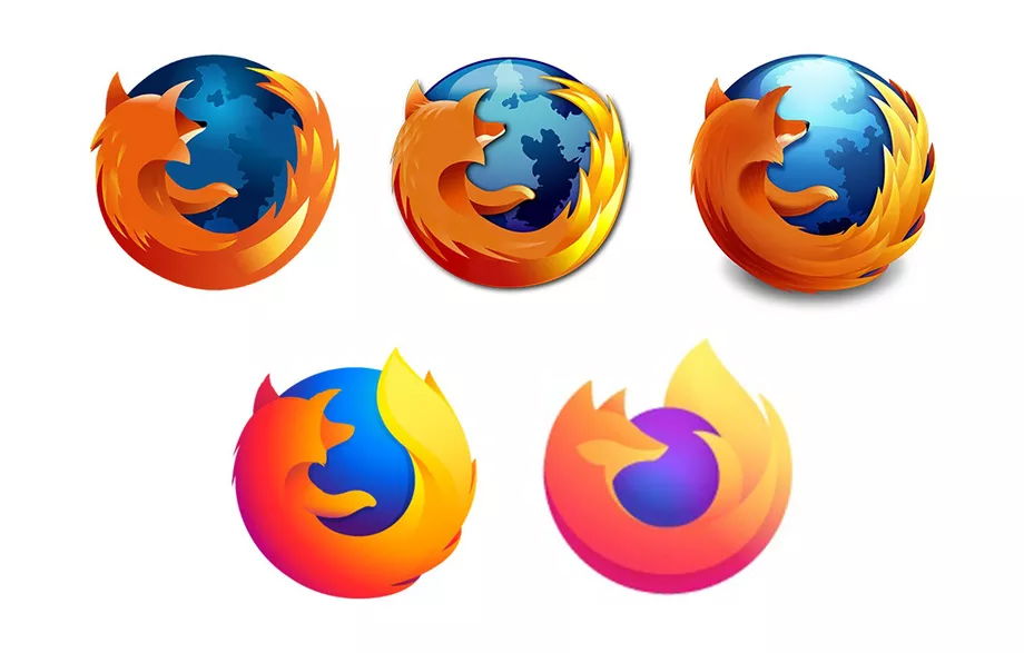
I think the longest outrage I have experienced people being unhappy with the new logo changes of a company is Firefox. Every time Firefox has updated its logo it has been more minimal than the previous one and it is never received well by the public. People tend to love the original design where there is more detail in the fox and also the globe, however, I disagree, I love the new designs and it keeps up with current trends. The biggest flaw that no one tends to think about is when the client wants the logo to be in a 64×64 format, the more detail in the logo, the more pixelated and ugly it is going to look. With the minimal design, you will be able to keep that clean solid look and recognisability when it is that small. Firefox’s logo being minimal doesn’t make it simple either, a lot of thought has gone into the logo to show Firefox as minimal as possible and still keep its original recognisability. Overall I think it’s perfect.